Why left-aligned text matters in dementia-friendly writing
When we’re writing dementia-friendly information, quite simple formatting changes can make a big difference. One of these is the way we align the text. By understanding how different types of text alignment affect visual tracking and cognitive load, we can create more inclusive content that meets the needs of all readers.
Whether you write for a business or a public sector organization, simple best practices like these broaden your audience reach. They also enhance the way people think about your brand or organization as one that values accessibility.
About visual tracking when we read
Before we look at best practices for aligning text, it’s helpful to understand a bit about visual tracking.
When we talk about ‘tracking’ in reading, we mean the way we control and coordinate our eye movements to smoothly follow a line of text. Good ‘tracking’ means that we process words in the correct order and at a consistent speed for the best reading experience.
When we read, our eyes move from left to right along the line of text (in languages such as English that read from left to right). When we reach the end of a line, our eyes then sweep to the beginning of the next line. For languages that read from right to left (Arabic, Farsi, Hebrew, Urdu, for example) exactly the same principles apply, but in the other direction.
Effective tracking relies on coordinated fast eye movements (called ‘saccades’) and brief pauses (called ‘fixations’). When our tracking is smooth, our eye movements and pauses are well coordinated and we can follow written information easily. But, people living with certain types of dementia often find that it can affect these rapid eye movements and pauses. This means that reading becomes less efficient and processing written information is harder. Poor tracking can lead to skipped words and misreading or misunderstanding.
By designing our texts well, we can make reading more accessible for everyone. We can minimise difficulties in tracking lines of text by the way we align our written information.
Types of text alignment
Left-aligned text
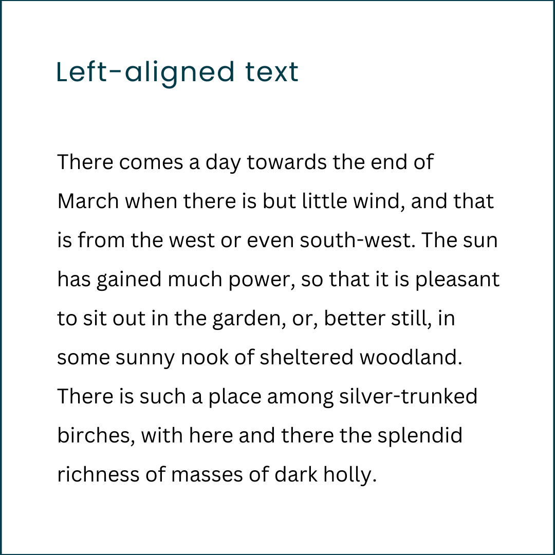
Text is aligned to the left margin, creating a straight, consistent left edge and a ragged right edge. This follows the left to right reading pattern, making it easier to read and process.
How we read left-aligned text
When text is left aligned, each line starts at the same point. This helps our eyes to move smoothly across the page and makes the information easier to read and process.
Centred text

Text is centred between the left and right margins, creating ragged edges on both sides.
How we read centred text
Centred text can be quite disruptive to the way our eyes naturally track information. The inconsistent starting points on the left disrupt natural reading flow and make comprehension harder.
Centred text can be used for short headers or paragraphs of a maximum of 2 lines, but becomes very difficult for anything longer.
Right-aligned text
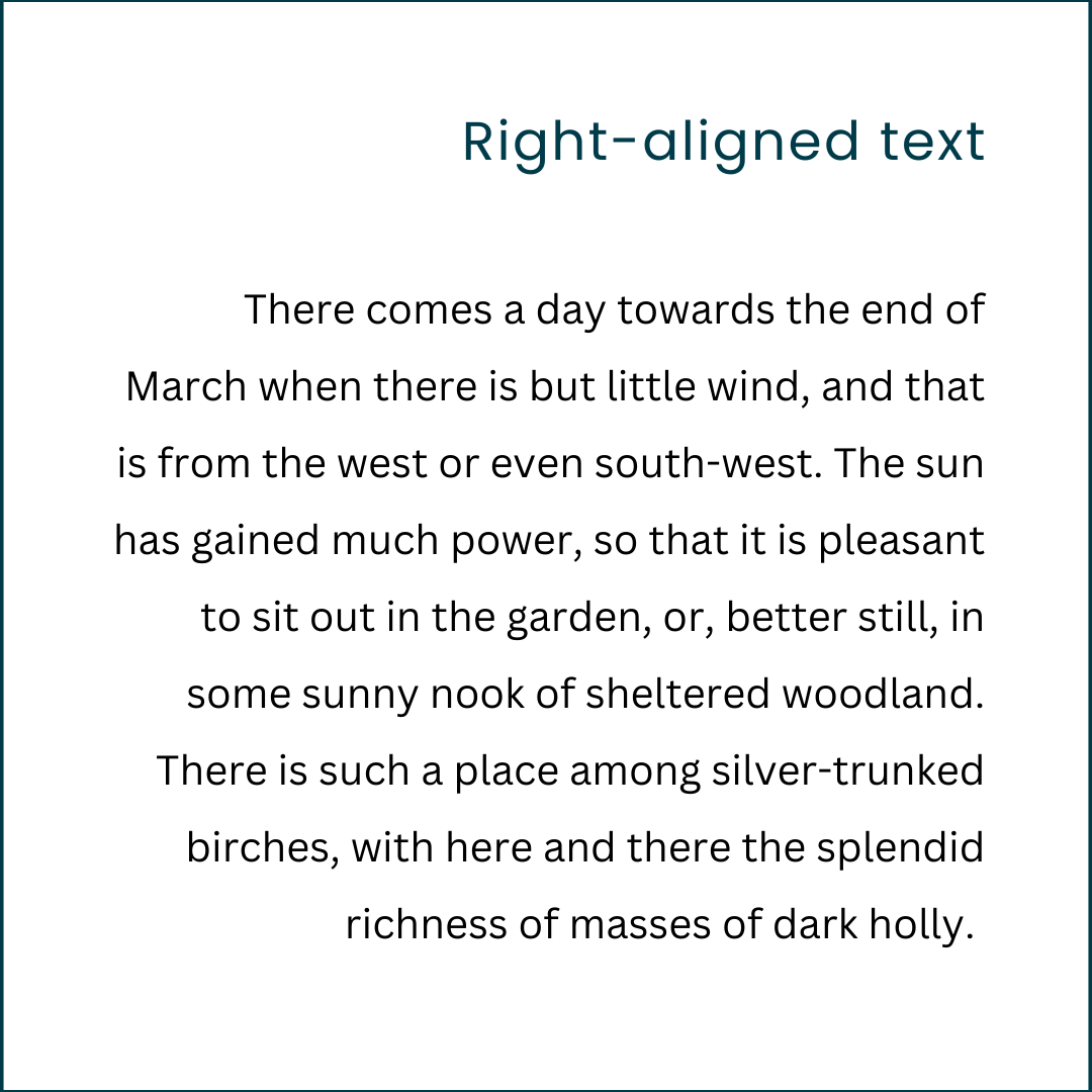
Text is aligned to the right margin, with a ragged left edge.
How we read right-aligned text
In the same way as centred text, having text aligned to the right disrupts the natural reading pattern. The left edge of the paragraph is ‘ragged’. Lines start in different places. Dementia can make it difficult to accurately locate, and align the eyes to, the start of the next line, so having an uneven left edge makes it worse.
Don’t forget that if you’re writing in a language that reads right-to-left, the same applies but in the other direction. For those languages, you should right-align text and avoid left-aligned text.
Justified text
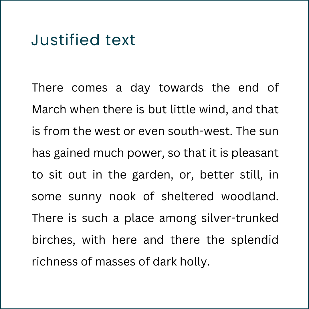
Text is aligned to both left and right margins. This creates straight edges on both sides and is often seen as visually pleasing and ‘neat’.
How we read justified text
The challenge with using fully justified text is that it produces uneven spacing between letters and words. We may not notice this normally, but reading justified text does increase the cognitive load for the reader. If your reader is living with dementia, or has other cognitive challenges, don’t make things that little bit harder by justifying the text!
Best practices for text alignment
If you want your written information to be smooth to read and easy to understand, it’s usually best to left-align the text.
One of the biggest challenges to consistently left-aligning text for accessibility comes from the design tools and word processing software we use. Many of these tools default to other alignments, like justified or centred text. And as we’ve seen, these can be barriers to readability. In-house design teams and/or corporate branding guidelines sometimes also prioritize ‘pretty’ over ‘accessible’. If we’re not careful, these can hinder our readers who are living with dementia.
Accessible design doesn’t have to be bland or restrictive. With the right information, mindset, and creativity, we can create visually appealing content that is also easy to read and understand for everyone.
As we’ve seen, left-aligning text is a straightforward, but powerful way to improve readability and accessibility, particularly for readers living with dementia.
By adopting these kinds of design tweaks, our businesses and organizations can make sure their content is accessible to everyone and demonstrate that they prioritize accessibility. Embracing dementia-friendly writing principles is not just a matter of design preference but a commitment to creating content that truly serves all readers, enhancing their experience and your organization’s reputation.
BIBLIOGRAPHY
Accessibility Testing and Audit Services. (n.d.). Accessibility Testing Services | TestDevLab. [online] Available at: https://accessibility.testdevlab.com/accessibility-testing-services?campaignid=568006024&adgroupid=1178678210245302&extensionid=.
Coubard, O.A. (2016). What do we know about eye movements in Alzheimer’s disease? The past 37 years and future directions. Biomarkers in Medicine, 10(7), pp.677–680. doi:https://doi.org/10.2217/bmm-2016-0095.
Ling, J. and van Schaik, P. (2007). The influence of line spacing and text alignment on visual search of web pages. Displays, 28(2), pp.60–67. doi:https://doi.org/10.1016/j.displa.2007.04.003.
Nimble Approach (2023). Balancing Act: Good Design vs Accessibility - Nimble Approach. [online] Nimble Approach. Available at: https://nimbleapproach.com/blog/good-design-vs-accessibility/ [Accessed 21 Aug. 2024].
thewebsitearchitect.com. (2020). Does Text Alignment Matter for Accessibility and Usability? [online] Available at: https://thewebsitearchitect.com/does-center-aligned-text-matter-for-accessibility/.
Text for alignment examples from: Project Gutenberg. (2015). Colour in the flower garden by Gertrude Jekyll. [online] Available at: https://www.gutenberg.org/ebooks/50764 [Accessed 21 Aug. 2024].
Arrow image Photo by Nick Fewings on Unsplash
© Heather Eason 2024